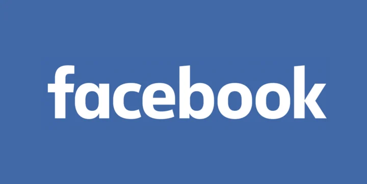
Most of us barely noticed that Facebook, after leaving its logo alone for about ten years, made a change in the last few days.
Creative Director Josh Higgins said they wanted something friendlier and more modern.

The clearest shifts: the letter a is now a single-story form, and the o and e look more oval. The change only applies where the full brand name appears; the symbols used in the mobile apps and similar places stay the same.
